Bottom line: practice is king.
We found that students used the study app in very different ways: some consistently throughout the class, others only to cram before the exam, and some barely or not at all. Those who used the app for self-regulated learning outperformed those who didn’t.
That was the longest road I have taken so far. Five years have passed since I first saw the data, and even longer since it was collected. Conceptually, I have moved from a classical “squeeze the maximum out of the data” mindset to a more transparent post-positivism. The data was still tortured.
Read the paper: - Student engagement profiles in a mobile app: Links to self‑regulated learning and performance (ETRD, 2026)
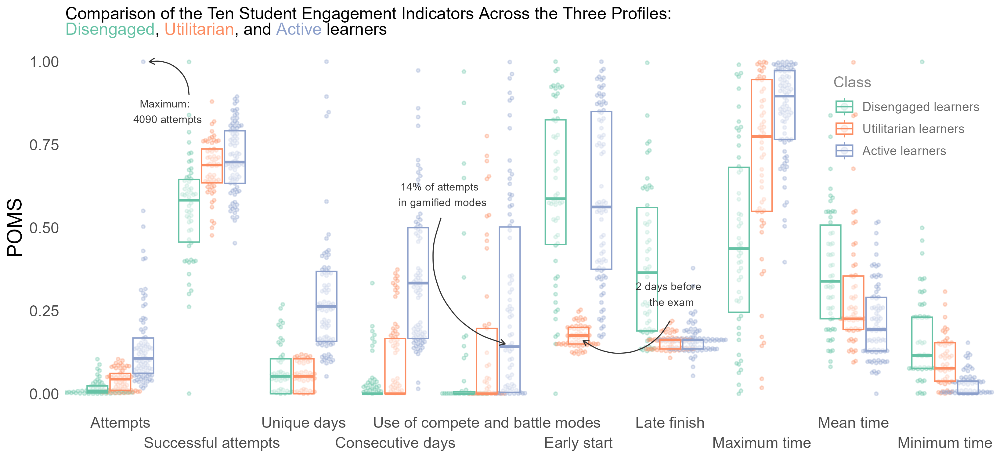
I created my most complicated visualization to show 193 observations across ten continuous and categorical axes. It is messy, but I like my arrows and Epanechnikov’s kernel.